Making electrification accessible and exciting for everyone, that’s what Nissan set out to do with their Ambition 2030-plan.
Making electrification accessible and exciting for everyone, that’s what Nissan set out to do with their Ambition 2030-plan.
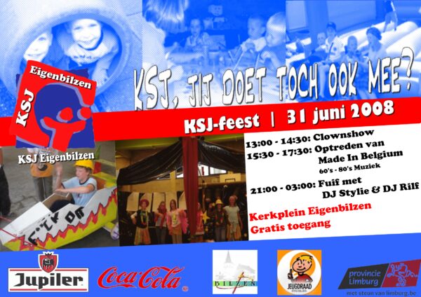
Back in 2007, I designed my first ever poster as an assignment for a course in communication. It wasn’t pretty, but it was how I got my start in design.
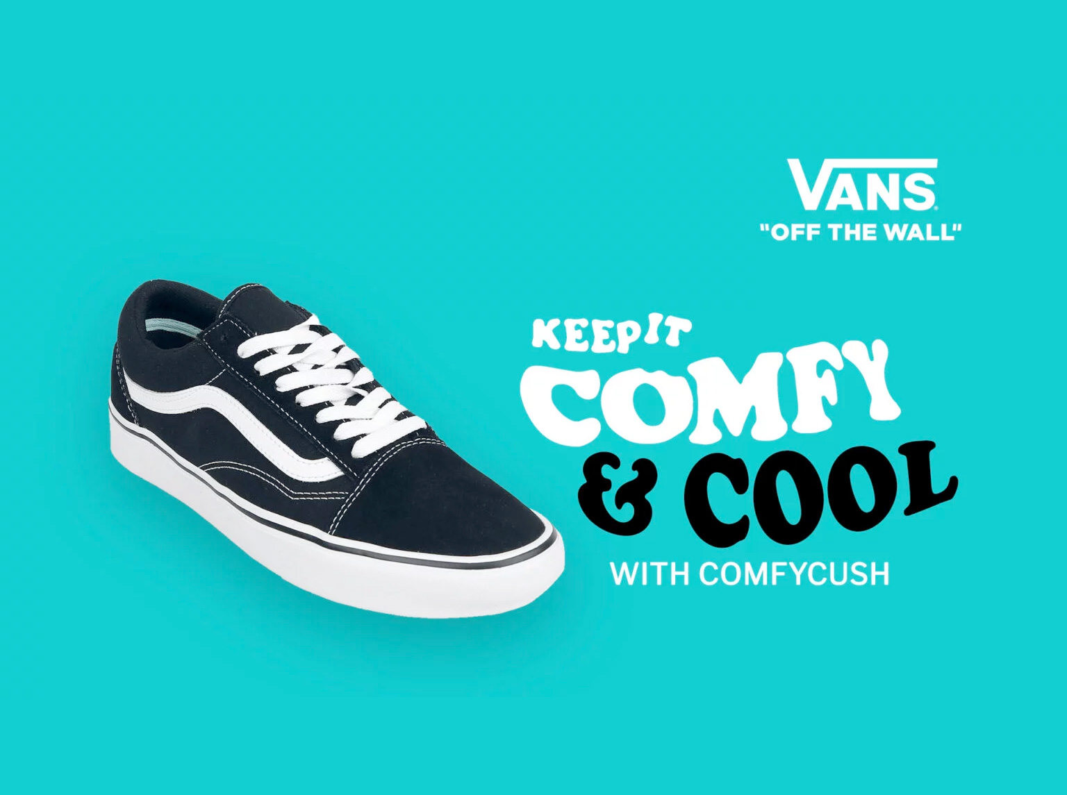
How do you promote sneakers on social media during lockdown? Easy: keep an eye on the trends & the biggest one is the rise of the video call.
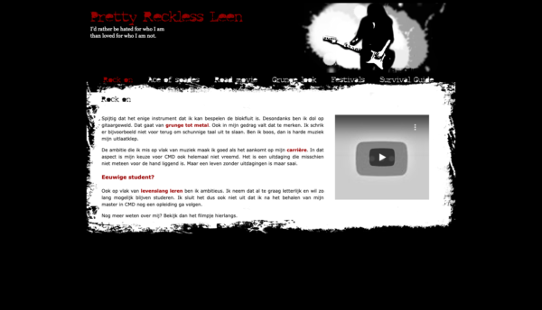
Throwback to 2010, when I was getting my master’s in audiovisual arts. Back then, I was tasked with coding & designing my first website. Let’s just say I’ve grown a lot since then… While I had dabbled in web design and development when I was still majoring in marketing, this assignment was on a whole… Continue reading My first website
After getting my degree in Allround Digital Photography, I felt an itch to keep challenging myself in photography. Anneleen fotografEET is the product of that itch.
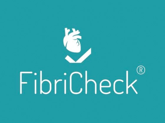
Did you know that arrhythmia is one of the most common cardiovascular diseases? Obviously this is quite dangerous, so regular checkups are important. Enter FibriCheck: a medical smartphone app that detects rhythm disorders.